BOOM! The cycle has finally reached it's conclusion, and we have our two winners! Check out their outfits, scores and feedback below.
FIRST PLACE :
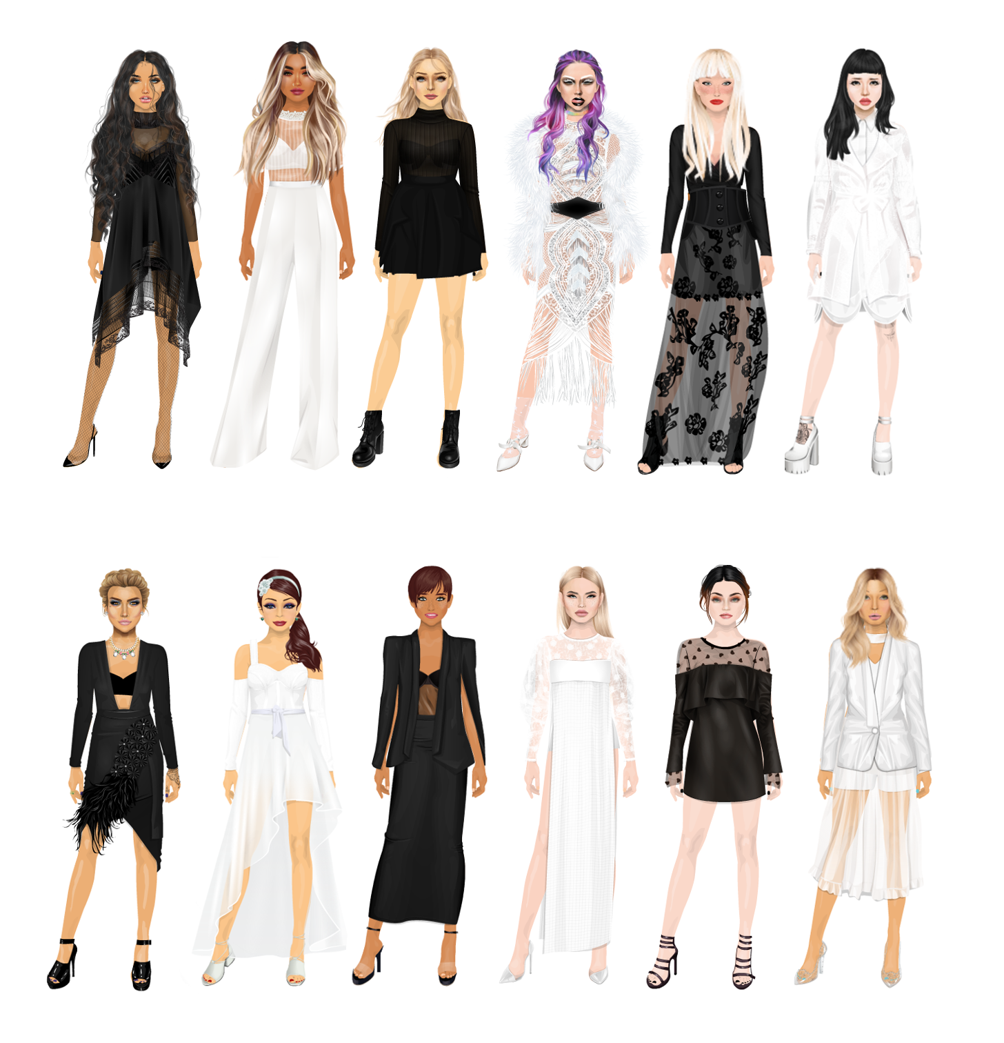
LOVEFOTINH - 8.25
 |
| More info: https://imgur.com/SCjWvp0 |
Mireia
Okay, so I love both the outfits you did on your suite but I'm not liking that much the ones you created on the plaza. Talking generally about your entry, I would have liked more cohesion between the four outfits. Louisa did it better in that aspect as her collection truly looks like a collection. Yours has common items but at first glance does not look from the same collection.
First, I'll talk a bit about the trends. I really like how you approached each one of them except for the "Not My Clothes". That blazer is too huge and feminine for my taste. Loving though all the rest of trends and the extra ones you added. I wasn't very sure of your jeans at first, but each time I look at them now I like them more. So trends... really well incorporated.
Now about the outfits individually.
I love the colours on the first outfit and the shape of the outfit in general. The butterfly purse is a bit unnecessary for me, I would have liked something more simple and maybe the rest of the black accessories as well. I would have liked you keeping the nude tones and it could have turned out into a really elegant and beautiful outfit.
Second outfit would be nice without the huge blazer as I mentioned before. The color combination is again great, but the shaping here... not so good even though I have to say that I love the accessories with which you finished your outfit.
Third outfit is by far my favorite. Great incorporation of the trend, colours look very very nice and likeable and I love this futuristic vibe it brings. Wouldn't change a thing
And last, the fourth outfit is again a bit too much for me. I really like the two different waists of the jeans and how it shows thanks to the bonded shirt, but I think I would prefer only the transparent turtleneck in there. Also I like the choice of shoes, but not the bag. I think a black one would have made the shoes and turquoise earring pop out even more.
In general you did really good in this cycle so I wish you the best of luck for this finale and... of course: big congratulations even if you end up first of second!
LUCY
I immediately agree with Mireia 's first point - the suite outfits are better than the plaza ones. For me, it comes down to how the plaza looks just look so much more, in terms of layers and details, which the other two lack a bit.
I also agree these colour have done with being a bit more cohesive. I love the two looks with the bold coloured shoes and bags, and would have liked to see that carry on into the other two outfits, because I like the contrast between the dark and edgy and the soft and pastel, I just wish they'd made more sense together.
I think the trends have been added in really well, if I hadn't known we'd asked you do do them I never would have picked them out, which is rather the point.
For the first look, I do't get the dark accessories, particularly the butterfly bag. For once I don't mind the slightly different white and tan tones, and the textures are lovely.
The second look, I'm not too sure what the silver bauble bits are doing, but I like the layered tops and the pops of red and blue colour.
The third look also has an unnecessary silver bauble...thing, in this case on the jacket. This is the weakest look of the bunch, being comparatively plain. I like the bag and the cheeky attitude it has, but there's no real "wow" factor.
The fourth look I love, there's layering and texture and even the double jeans manage to look cool. I think I'd agree that the bag isn't quite right, though I do like that the colour ties with the shoes.
I'm glad that you kept silver as the overall metallic here, because it's more cohesive in that respect.
LEIGH
I'm not...really convinced about the trends here. The plastic is more like "lace" and the fluffy shoes are a bit less weird than I though you'd make. They don't look bad though.
The fourth looks is hands down my pick of the bunch because the colour pops looks very cool and there's lots to look at, but the dark colours stop it from being overwhelming. Unlike the others I like that bag! I also like how the single earring, coloured shoes and bag tie into the first look, and think like Lucy it would have been nice to carry that theme into the softer looks to make them co-ordinate a bit more.
The butterfly clutch really threw off the first look for me, I liked the concept of doing a soft look with edgy extras though and the moth eaten jacket is a cute way of doing it.
Looks two and three are really tied for me for opposite reasons. The second looks has so much going on it's so unbalances and bulky while the second one there's not much happening at all. I'm not mad that the second look has the same jeans on as the fourth look, but something different would have been nice.
As Lucy said the use of silver on all the looks is very smart and does unite these looks a bit more than they would be without it.
SECOND PLACE:
Louisa.Karemina - 7.83
 |
| More Info: https://imgur.com/a/fWswh |
Mireia :
First thing that I see when I look at your entry is totally a collection from the same designer, everything coordinated and I love that. I love you using the same colours and common items like checkers and graphics for example. Really good general entry!
Now I'm gonna talk about the trends and how you incorporated them. That's not the strongest part in this task. I mean it's not bad but I think you could have done better with each of them. The jeans for example are weird but don't look that good. The plastic boots are a great choice but with the checkers underneath are less visible. And well I do like what you did with the last three trends.
About your outfits individually. I have to say that they win a lot when you see all of them coordinated in black white and denim and with the checkers, graphics and silver detailing. Cause when I first saw your entry I was like woah so cool, but then I stop to look at your outfits and I'm not that sure of them.
First outfit I already mentioned that the jeans look weird but don't look good. I love how the corset top is incorporated and tugged into the jeans, and I like how the accessories are not the ones I would have gone for but look pretty good with the outfit. Well done in that one.
Second outfit is one of those that each time I pay more attention and like less. First the thing of the tights underneath the plastic boots that I already mentioned. It would be such a stronger outfit without them. I love the details you added to the shirt, but the headpiece and back look so random and out of place in here.
Third outfit is the one I liked less when I saw your general entry but the one I like more paying attention to detail. Love all the sleeves poking out of the big sweater and although I like other sweatshirts way more than the one you choose you did a nice job combining it. The skirt made out of belts is a great idea carried with good execution. Good job!
Forth outfit is nice, but two bags? Why? The belt is not one of my favorite additions to this, and if you were gonna use dark tights and shoes, maybe you could have added a black belt for example? I think that would have tied your look better.
I think you did a really good job, and I do see an improvement from your first tasks, so that is a very good sign. I'm happy you were part of the cycle, and I wish you the best of luck for this finale, even if you end up in second place... congratulations for arriving here!
Final Score based on:
- Collection cohesion: 9
- Performance in following the given trends: 6
- Outfits: 7 + 6 + 8 + 6.5 --> media = 6.875
LUCY:
This is absolutely a cohesive set of outfits - the white and denim theme across the board works really well! They're definitely on-trend and street-style blog worthy looks. I love the incorporation of the sunglasses in their different positions.
The trend incorporation is a bit hit-and-miss here, the clear boots and double jeans look made for these outfits, but the fluffy shoes look rather awkward with the holey leggings. The men's jacket-dress is sort of just "fine" to me.
For the first outfit, I like the jeans well enough, but the various different denims between the two jeans and the belt don't really work for me, especially when you've added the bag and shoes with yet more different blues. I do love the shapes of it through, with the shoulder of the top reflecting the shape of the jeans.
The second look is...confusing I really, really want to like it, but I just can't quite. I love the glasses on the chain, and the kind of rebel schoolboy vibes with the shirt and tie. The headpiece is definitely not working. Unlike Mireia I don't mind the checkered tights much, but I don't love them either.
The third look is another case of "too many different blues." I do really love the various shirts and sleeves you've layered,and the checkered patterns work really well with the fishnet tights (and help the leggings of the previous look make a bit more sense.)
I totally agree with Mireia about the last look - it's nice, but what's with the double bags? And that belt? And as I mentioned before, the fluffy shoes with the holey tights I'm not a fan of - I feel like they could work in a more Avant Garde outfit.
LEIGH
The last look is immediately my least favorite, as the others pointed out the accessories are just all very weird choices. The shirt and skirt are cute but uh... that's it. That's all I have to say for this look.
Discounting that one, I like the denim and white,and how different these are. They're like three best friends!
I actually like the check tights under the boots because as Lucy noted it pulls in the tartan prints from the first look, and the fishnet on the third.
I don't not like the different blues (Unlike ^ Lucy who has kind of a vendetta) but I can't say it always works, like with the headband on the second and the accessories on the third. But I don't mind them on the first look because it looks a lot more like an intentional contrast to separate the items, which it works for to me.
I really love ll the little details you have put into all of these though, in terms of layering and cohesiveness, especially with the sunglasses.