The last two week's tasks have majorly shaken up the rankings! With the help of her previous week's win, AshleighDana once again get the top spot. BibikaEmonik, however, failed to submit and is eliminated.
- ashleighdana - 7.66 + 0.5 = 8.16
- green_lady_m - 8.03
- lostjetty - 7.41 + 0.25 = 7.61
- alma1902 - 7.5
- aniyah-xxxx - 7.25
- xmackennax - 7
- asb10 - 6.58
- Bueno-koekje_xx - 5.1
- bibikaemonik
ASB10 - 6.58
LUCY - What item are you supposed to be matching here? Your description is all over the place! You're supposed to pick a single piece, not decorate an entire room, and frankly, the outfit doesn't match anything here properly. It's pretty enough an outfit, sure, but not what we were looking for.
LEIGH - Too much stuff!!!! One item, not a million, and even with all of them, this doesn't really match any of it to me. It's too glam for the couch, the denim is too casual and shaggy for the chalice. The accessories are way too much all packed in around her face. And I can't really say anything good about the dress because anybody can put a dress on and look fine, so I can't find anything here that's really worth talking nice about, sorry.
LOSTJETTY - 7.41
FONTI - A very realistic interpretation of an insta-post, the matching of the hoodie with the bed is an WOW one. I love the sneakers, the bag, your look does match the theme so much! Your accessories in point, but perhaps I wouldn't layer the socks. Fascinating work.
LUCY - To me, this does not match - or sell - the product at all. You could have gone with a pajama outfit, which you didn't. You could have gone monochrome, which you didn't. You could have matched the prints - which you sort of did, with the shirt, but it's hardly enough. Then there's the issue of bulk - the chunky jacket, wide pants, big bags and badly place visor are too much 'big' in one outfit. No Instagram girl would be caught dead wearing something so unflattering. There's definitely elements of instacelebrity in it, but I wouldn't give her gram a follow for it.
LEIGH - I'm rather stuck between Lucy and Fonti. I do like the idea of it, but the result, eh, not really. Like Lucy I don't really think it makes sense - she doesn't look like someone who is using the bed, but she also doesn't look like someone trying to 'sell' it. It does look like an instagram outfit, but more like a day out with friends than someone who'd be anywhere near a bed.
ANIYAH-XXXX - 7.25
FONTI - Adorable vintage radio promotion! Your outfit is a bit extremely glittering for insta or for electronics, but somehow it works, maybe the colors help and that your layered laces have a retro feeling and not an event one. I don't like the studded sandals.
LUCY - Once again, this task wasn't meant to be a decor comp - you were supposed to pick a single item and go with it and, much like ASB10, your outfit and descriptions don't really lean towards one items more than any other. I thought I wrote up the task clearly, but seemingly, I wasn't specific enough. The shoes are honestly horrific and need to be recycled as soon as you read this. I like the concept of making a maxi skirt into a layered dress, but the varying browns and beiges - particularly the belt - are off putting.
LEIGH - Oh boy. Again, we were meaning for you to style one bit, not a room full. Like Fonti I'd have liked this better if you'd gone more casual, which the whole 'sitting room' of items imply, instead of this stuck-between thing. I don't like the belt, the shoes, or the bird brooch which looks terribly awkward. And the glasses are just... no. The colours are nice and like Lucy I like the dress-skirt thing, but this is really a miss besides.
Bueno-koekje_xx - 5.1
FONTI - Mmm I like the bold simplicity of your look, it has power and dynamics, it is MJ established! It is not a perfume look but once it is for insta, let's say it's an alternative one. I like you picked up items, there's not much layers as usually in your outfits, but the outcome is a really cool one.
LUCY - I think you missed so many major things - the perfume is very distinctly gold and floral themed, and your outfit is decidedly silver and printless, which is unfortunate. Not only does this not look like the perfume, it doesn't look like the kind of glam girl who would use it. You also used the literal Wang tribute mannequin pairing of top and bottom, which is so completely unoriginal. I really don't know what else to say about this.
LUCY - I think you missed so many major things - the perfume is very distinctly gold and floral themed, and your outfit is decidedly silver and printless, which is unfortunate. Not only does this not look like the perfume, it doesn't look like the kind of glam girl who would use it. You also used the literal Wang tribute mannequin pairing of top and bottom, which is so completely unoriginal. I really don't know what else to say about this.
LEIGH - I IMMEDIATELY saw that it was the same combo as the mannequin, and honestly this is just lazy all over. No layering, average accessories, and worse still, you made it in the plaza so the items would have been pretty obvious the two bits went together already. There's no floral, no gold, no layering, nothing about this is original or similar enough to the perfume to make me not scream 'COPYING.' No, no, and just no.
Green_lady_m - 8.03
FONTI - Wow, here's a different approach than the other ladies'! I like your vibes and you look like a Harley girl. I feel like there's something missing, maybe gloves, maybe tattoos, not sure! However, you did a fine styling, persuasive for your big bike lady.
LUCY - even with the extra tire and lights, it's very obvious the kind of look - and matching item - that you are going for. I think the shiny pants are a nice addition, because in an all-black outfit, textures make a big difference. Like Fonti, I think you could probably have done with a tattoo or something for that final piece of edge.
LEIGH - I don't adore the look but it does match the bike well, I think it's maybe the 'girls' jacket that throws me off it, maybe a red lipstick could have pulled that in more for me. If I saw a choker-wearing, leather-pantsed instagrammer on a motorbike, I'd follow her immediately!
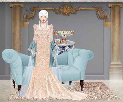
ALMA1902 - 7.5
FONTI - Beautiful styling and makeover Alma. I could imagine this as an insta post only for Kim, it's too royal for insta in my opinion, same as I stated for ASB. However, your layers are super fine, same as with the colors, the textures, the jewelries. What do not fit in my opinion are the shoes, too plastic for the look.
LUCY - I actually think it's the perfect amount of glam - because plenty of insatgrammers and celebrities on the 'gram, post pics in their pre-party gowns. I love the textures, and the layers, particularly the spotted tulle going with the round chandelier baubles.
LEIGH - I don't know if I like the top half much, but the layered skirts are perfect and the chandelier was a smart choice.
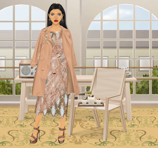
ASHLEIGHDANA - 7.66
FONTI - Cute look but not too cohesive in details. I like the trench, the bag and the boots (even if they don't look quite comfortable). I like the idea of a pleated skirt but this one is not the right one (wrong brown). I like the idea of a floral blouse but your layered top is not quite a good one. The entry should have been worked further.
LUCY - What I don't like here is the layered tops - while I get that you wanted to put florals into it, the 'pretty' shirt seems like it would have been plenty on it's own. I love the logic behind the shoes, I like the colours of everything you've chosen too.
LEIGH - Meanwhile I really love this! I ride my bike and the thought you put into the description and choice of items is perfect to me, there's nothing like a long jacket, slight heel, and cuteness to really make a bike ride fun. I like the top layers! And the earrings look like bike wheels. I think the bag is not perfect, but not awful.
XMACKENNAX - 7
FONTI - It's a weird item the one you picked up but I like it, it has potentials. Potentials that you didn't reach I'm afraid. Your outfit should be more modern. Instead of going for neutral cold tones of blue-gray-white you went for a silver-ish outfit with not finely matched textures. I would possibly keep the white mini dress and the heels and would change all the rest.LUCY - I feel like you chose a great item, and a nice starting point, and then really ruined it with the accessories. I like the dress, top, and I think the underskirt could have worked if it was a different colour, as it does match the shape of the lights. This certainly isn't the worst gold-and-silver combo ever, but it's a long way from being the best.
LEIGH - Yeah, girl, you kinda overdid it on the sparkles. I feel like you could ditch the necklace, maybe use a smaller bag, and then you'd be good to go. Maybe use some earrings? I don't know, the idea was there, just not the end outfit.


No comments:
Post a Comment